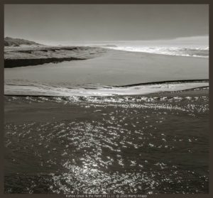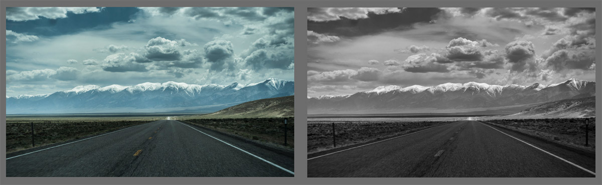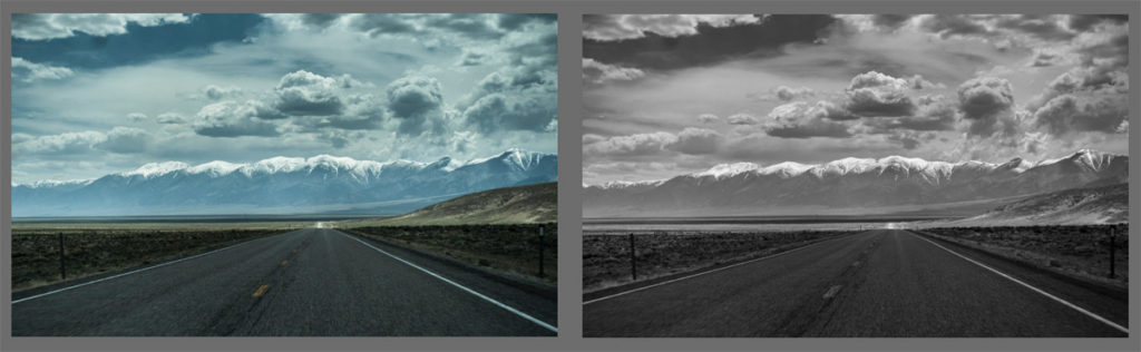
Northern Nevada Highway
Readers respond to last week’s post
Last week I wrote about a dilemma I experienced while processing a recent photograph I had made. In my post, Uncharted Territory – Monochrome or Color I expressed disappointment in the quality I got when I converted the color image to grayscale. I asked readers to take a look at a couple of samples and weigh in on which of the two versions of each image worked best.
I received a significant response and found the comments provocative and illuminating. Following is a breakdown of the totals sorted by preference, followed by excerpts from comments both publicly posted at my blog as well as ones sent directly to my email. After these representative comments I will make some closing remarks summarizing my current thoughts on color vs monochrome photography.
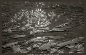
The untitled photographs embedded here are representations of what happens to certain images when converted from color to monochromes. Click on them to get a larger, better look.
Totals
Preferred the color rendition: 13
Preferred the monochrome: 6
Both or couldn’t decide: 11
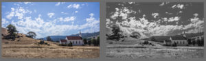
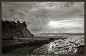
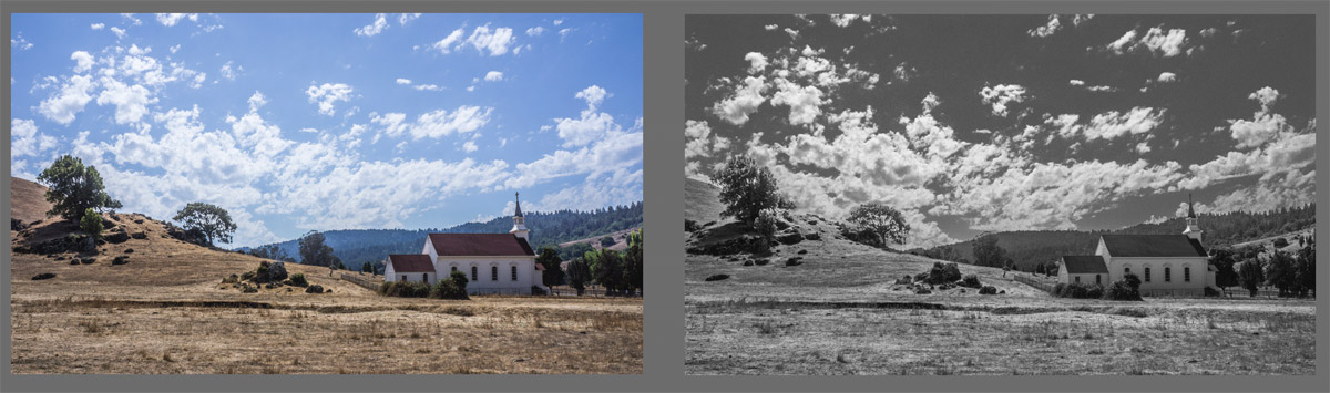
St. Mary’s Church, Nicasio, CA
Readers will recall that I was unsatisfied with my attempt at converting a color original into a monochrome version. I felt that I lost some of the presence, the graphic quality of the landscape, in translation. Also, I wondered if I was even preferring the color version. This was out of character for someone who has produced only monochromatic photographs for more than 30 years, I asked if anyone wondered “if had lost my marbles?”
Here are some of the comments I got, both from emails to me and posts on the blog page:
Dianne:
No, you haven’t lost your marbles! I LOVE the color; it’s so clearly Spring and completely JOYFUL, where the monochrome just doesn’t convey that energy.
Bets:
…vista is just too big for b&w in this case
Barbara:
The clouds jump out more in monochrome. But the water and hills look nicer in color.
Anne:
The colour works partly because the colour palette is minimal – blue, green and white.
Rishi:
The monochrome is far more powerful, looming presence, dynamic strength. The clouds are urgent and almost jump off the page. In color they are friendly, here the emotional impact is insistent and attention-grabbing.
John:
…in the first pair of photos, I think the color version has a lot more pop, and tells the story better. The different colors in the photo all translate to a much narrower range of gray tones.
In the second pair, though, I do prefer the b/w version. The composition is simpler and the different areas are well distinguished without need for color.
Mary:
I felt the clouds in black and white were strong, almost demanding of attention, whereas in color they seemed almost an afterthought.
Tom:
Although pretty, I find the color version a bit too much like a travel postcard for my taste. I think the monochrome in large would be better.
Sue:
Both images are lovely. However, I find the textures of the monochrome completely irresistible and could study the image for a long time. In color, my eyes sweeps across and sees familiar blues and greens and I’m less inclined to linger.
Tom I.:
Observation: the subject has tremendous detail in an expansive frame, and perhaps lacks the strong, few elements and high contrast that BW exploits so effectively.

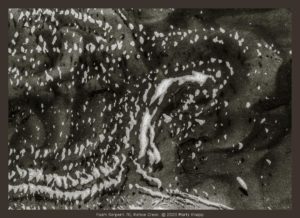
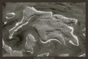
Frosted Leaves of Grass
Then, finally, I heard from an old friend with whom I’ve had many stimulating discussions about visual perception. We share a love for black & white photography. I have excerpted his longer email for the salient points. I think Stuart articulates very well why I was in such a quandary about the photographs I recently posted at my blog.
Stuart:
…the color version shows better contrast between the water and shore features…likely to be because the luminance contrast is low so that one must rely on color contrast. By comparison the clouds in the scene are more dramatic in B& W. Here the luminance contrast is strong.
…color and form information become separated early in the neural pathway. Form is carried at higher resolution than color. Thus, the color information (blurred) can distract from form information (sharper). So the form stands out better in B&W because the distracting color information has been removed. But, if the luminance contrast is low, color information is needed and B&W does not work.
Thus, B&W works best if luminance contrast is high and form is the dominant feature of the scene.

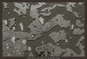
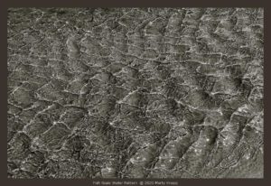
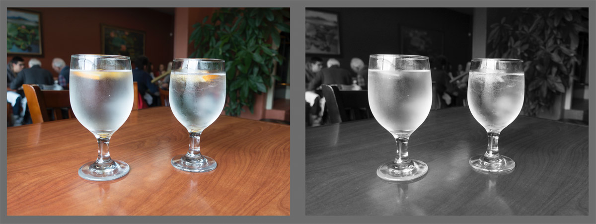
Two Water Glasses
Closing thoughts
It was stimulating to read so many excellent comments. They provoked me into taking a closer look at what I have been doing and why. Putting a little distance between my efforts of last week helped also.
From time to time I find that I’ve made a landscape image that looks better to me in color. But, I love the monochrome so much that I quickly abandon any plans to show it in color… so far! I want to step away from the color and explore what is underneath it; forms, lines, textures, shadows, the light itself. These feel primal, fundamental and deeper to me.
So, for the time being, I’ve decided to stay the course. I will remain faithful to my monochromatic work. I suspect that if and when I include color photography in my portfolio it will be of my macro or abstract creations. For now, the landscape will be in black and white, as it always has been.

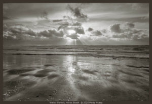
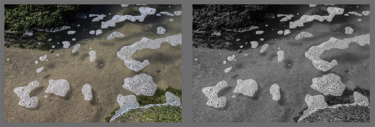
Surging Bubbles, Point Reyes Seashore