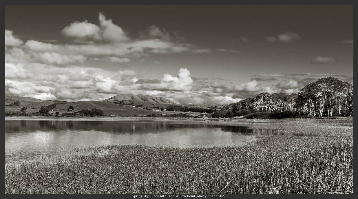
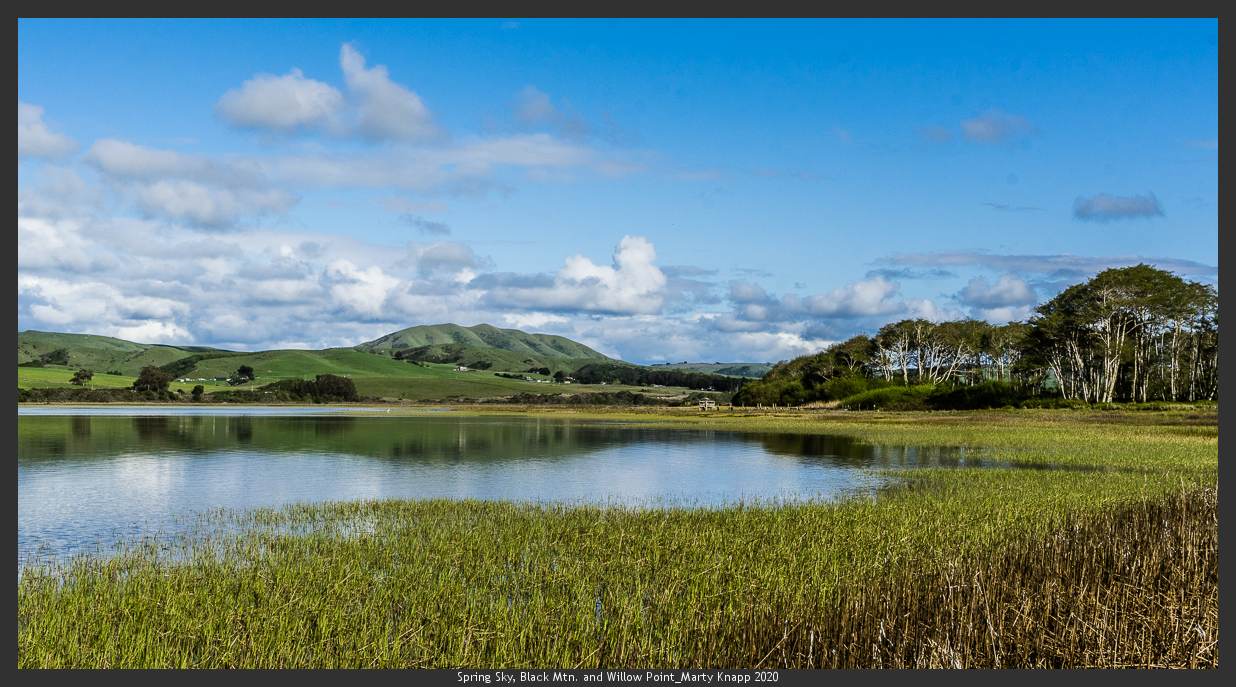
I’ve entered uncharted territory. . . .
For the past two days I’ve wrestled with a couple of new scenic photographs I had made on Sunday afternoon. The more I worked on them, the less I liked them. I just couldn’t seem to get these images to express what I saw and felt as I photographed the light at a favorite place, near the village of Inverness, on the shore of Tomales Bay.
What I saw was the singular beauty of Black Mountain, its folds accented by the late afternoon sun. The clouds above the mountain were spectacular, puffy cumulus, brilliantly lit as well. The foreground included rivulets of shining water, remnants of the receding tide. The light shone everywhere, including on a swamped duck boat at the water’s edge. As I stood watching and working the scene with my camera, I felt deeply happy, grateful I could be there to witness such a moment of light.
Later, back at my studio, I couldn’t get my new images to sing, to reveal what I had experienced, no matter how many ways I processed them. The mountain fought with the clouds, and the grasses and tidal waters merged making it unclear where land ended and water began.
What follows is my best version of that scene, made last night. I was ready to give up, until it dawned on me that maybe this photograph was never meant to be a monochrome.

As much as I pride myself on being an exclusively black-and-white photographic artist, I decided to peak under the hood of my image for the original color record. (Note: beneath all of my digital black and white images, there’s a full color version that I’ve converted to monochrome!) Normally, I take only a cursory look at the original color before moving on to my conversion, but this time I bravely looked again.
What I found was both delightful and a little bit threatening to my self-declared artist image. In the color version, the mountain stopped arguing with the clouds and the water knew its boundary with the land! I could even see the duck boat again. The color rendering looked and felt more like what I saw and felt when I stood there earlier in the week. Well, what was I going to do, now?

So, for the time being, I’m letting both versions see the light of day. I have no idea where all this goes. I’ll be writing more about this in the coming days. In the meantime, I’d love to hear your thoughts. Please let me know what you think about all of this: have I lost my marbles? Should I change my ways and add color to my expressive work, or should I leave well enough alone? I’m all ears. Write to me here: info@martyknapp.com
Before I go, here’s another photo from that day shown in both versions:
Depending on what it is one is trying to achieve in photographs for me the B&W works because photography like art should be an abstraction on life or how we perceive
our visions of life to be. If one wants reality then a snapshot as demonstrated would do. But then it would just be an ordinary photo anyone could take.
Since you asked…,
I like the monochrome renderings better in both cases. I think that the contrast between the clouds and the blue sky is lost in the color version, and the rest of the colors in the scene don’t make up for the loss.
But I also think that Bets makes a very good point. For me, the reason that the mountain does not stand out has nothing to do with whether the scene is rendered in b&w or color, but instead, because so many elements of the composition (the S-shaped strip of brightly lit grass, the strip of still water reflecting the sky, and the descending line at upper edge of the clouds) lead my eye to the illuminated stand of trees on the right side of the frame. I find that those trees are the most interesting thing in the frame, and the other elements of the photo keep moving my attention toward them.
Marty, thanks for posting the images and initiating the discussion. I hope you are doing well, and I look forward to another trip out west once we are free to travel again.
Wow! You took on a lot with this picture! Ditto what you and others have said about the differences. I also think the vista is just too big for b&w in this case. I don’t see the mountain much at all in either view. I remember someone (you?) taught me to look at parts of things abstractly through an empty cardboard slide frame and am wondering if looking for a more compelling abstract could be done with the original image without losing too much resolution. Regardless, I love your openness about your process. ❤
Marty –
I would say that even though these photographs do not please the artist in you, they do bear witness to the wonderful life’s work you have, and experience daily. Amongst all men, that is extraordinarily rare.
You say it best yourself: “I feel deeply happy, grateful to be able to witness such a moment of light.” Enjoy that.
Ansel said “Landscape photography is the supreme test of the photographer, and often the supreme disappointment…”
The clouds jump out more in monochrome. But the water and hills look nicer in color. Each picture will be different and worth trying both ways.
Editor’s note: The following comment was edited slightly for brevity:
Good Morning Marty,
I seldom leave any comments, but your request has such a similar ring to it, to what I know to be true for me in my now retired career, as a Marriage, Family and Child Therapist. The client tells me where and what path I need to go on – each client and each path being different. I believe art is the same way: each piece of photography, each painting, each sculpture, also tells us where we need to move. We follow the path that is being laid out for us allowing development with our skills and support, not our interference. I’m reading you do something similar with your art. Thank you for sharing. I’m enjoying the color shot: why? I believe you said it: it’s more distinctive in it’s forms otherwise the forms get lost in the texture. To be sure, I haven’t done photography nor art since I was a kid, so I really do not know what I’m talking about. Yet, despite that, it is fun to talk about it. Have a great day and stay healthy! Love the photography. You keep giving me inspiration.
S. Sands
I feel there is tension in the black and white photo and relaxation in the color photo. Might be my quarantine isolation, but I prefer the color. When I scrolled down to it, my shoulders dropped a couple of inches. Thanks for the trip to the coast. I really need it.
Hi Marty
A very interesting problem. I tend to agree with John Kupersmith’s take on both photos. The colour works partly becasue the colour palette is minimal – blue, green and white. If there had been any more colours it would be too busy.
I’m curious to know if you have tried keeping the colour in the first photo but toning down the key – somewhere half-way between full colour and back and white. I’m thinking this might fix the greyness but keep some of the energy in the clouds that is seen in the black and white version.
There’s a lot to be said for both images. And I’ll leave the warmth and comfort of the color image for your decision.
The monochrome is far more powerful, looming presence, dynamic strength.
The clouds are urgent and almost jump off the page. In color they are friendly, here the emotional impact is insistent and attention-grabbing.
Hey, if Ansel Adams could do color, so can you.
I’m normally a b/w guy (should be – you trained me!), but in the first pair of photos, I think the color version has a lot more pop, and tells the story better. The different colors in the photo all translate to a much narrower range of gray tones.
In the second pair, though, I do prefer the b/w version. The composition is simpler and the different areas are well distinguished without need for color.
That’s my 2 cents worth. Interesting question, thanks for posting!
Hi Marty,
You know I already think you’re a black and white genius. I’m of the mind that the subject matter will take you in the direction that works for you. I felt the clouds in black and white were strong, almost demanding of attention, whereas in color they seemed almost an afterthought, like my attention bypassed them at first and went to the sundrenched blues and greens, a totally milder feeling, maybe a calmer feeling. Hard to make a choice, maybe have to see what color wall it would hang on.
I am thinking that there must be a reason our eyes see color, not in black and white. It appears you have completed a voyage of discovery. Yet at the same time, the night sky is still in black and white. Color would not add a thing to that for me. It’s just so much more elemental that way.
Thank you Marty! I have always loved the springtime views of Black Mountain in green and blue.
I love the color on both. Doesn’t mean you have to change everything!
Marty, I have been waiting a LONG time for you to hopefully choose this NEW path! Count me in for a color print of at least one if you decide to go that route !!!
Dear Marty,
No, you haven’t lost your marbles! I LOVE the color; it’s so clearly Spring and completely JOYFUL, where the monochrome just doesn’t convey that energy. Congratulations on your surge of courage! Maybe your self-imposed artistic identity is undergoing some expansion. ?
Sincerely,
Dianne
A variety of reactions summed up in wondering if every scene must necessarily look better in monochrome. It goes without saying (although I will) that you are a wonderful and accomplished monochrome artist – I love your work. But, as you have said, beneath every monochrome work lurks a color one.
I agree with you about the folds of the hills and the duck boat leaping out in color in the first set, and I like the blue behind the trees in the second set.
Why is it necessary to make an absolute choice?
I love your work and monochrome has always been magical. But given the times in which we live ( the two of us very much at risk seniors) color is cheering.