The art of making a photograph involves many decisions starting with the positioning and timing of the original exposure and culminating with critical considerations that affect the expression of the image in either a print or electronic version for website or email. No matter how much work goes into trying to “nail” the original composition there is almost always a considerable amount of work needed afterwards to successfully express a fine image. With the advent of nearly automatic focus and exposure available in today’s digital cameras, perhaps the most important decision of all is how to crop your source material. A well-considered crop can spell the difference between a good photo and a compelling one.
During the last several days I went through exposures I made during the last year. I was looking for the best candidates from thousands I had made over the preceding 12 months. In looking, I hoped to detect trends in the subject matter that I had been drawn to that could then help inform my further progress and perhaps suggest a continuing, deeper direction. Last night while I worked on a photograph I made at Drakes Beach last winter, I was reminded how critical the final crop can be. In Lightroom, I made several virtual copies and adjusted each to a different crop for comparison. I’ve posted several of those here to illustrate why cropping matters. First up is the full frame of the scene:
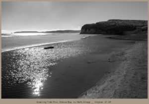
Original .67 AR
This is the only exposure I made of the scene. I positioned my camera to capture the brilliance of the late winter sun on the nearby lagoon and out at the point. The sandy beach on the right leads out to the nearby landmass on the right, which in turn leads the eye toward the distant point on the horizon left. But last night when I looked again, I wondered if I could improve it. I made several virtual copies in lightroom and adjusted the crop on each one separately. My first crop variant was a square one here:
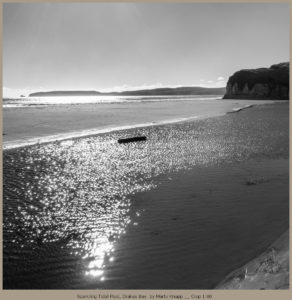
Crop 1.00
In this square version, I kept the brilliant reflections of the tidal pool, but removed most of the large bluff on the right. Notice how the driftwood log seems more important, taking center stage if you like. It seemed too centered, so I decided to return to a horizontal approach, but this time much more panoramic than the original composition. Here it is:
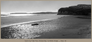
Crop .42
Here, the driftwood log remains a featured player, but is supported by the long shapes of the near and far landforms. I’m still not sure which I like best. Because I sometimes have need for a “banner” image to head a webpage or email, I made one more version, here:
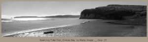
Crop .25
I’m still mulling over which one I’ll add to my catalog. In the meantime, I wonder which one you like and why? I welcome your comments.